Workspace Redesign Case Study That Worked

On Monday morning, the office looked polished. By Wednesday, shared desks were carrying monitors at the wrong height, loose chargers, half-used notebooks and the quiet friction that comes with no one quite knowing where anything belongs. That is where a strong workspace redesign case study becomes useful - not as a before-and-after story for presentation slides, but as evidence of what actually changes when design decisions meet daily work.
For workplace strategists, architects and facilities teams, redesign is rarely about aesthetics alone. It is about whether a space supports movement, concentration, ergonomic comfort and a consistent employee experience. In hybrid offices especially, the real test is simple: can someone arrive, set up quickly and work well without claiming territory or creating clutter?
What this workspace redesign case study set out to fix
The project centred on a mid-sized European business moving towards a hybrid, desk-sharing model. Attendance patterns had changed, but the office had not. The layout still reflected fixed ownership, with desks that looked shared on paper and personal in practice. Employees were carrying equipment between home and office in tote bags, setting up with whatever accessories happened to be available and losing time every morning to small, avoidable adjustments.
The symptoms were familiar. Desks were visually inconsistent. Storage was either too permanent or too scarce. Monitor and laptop height varied from user to user, often creating poor posture by midday. Clean desk expectations existed, but there was no system to make them realistic. The result was a workplace that felt serviceable rather than considered.
The redesign brief was therefore precise. Create a calmer desk-sharing environment, reduce setup friction, support ergonomic working and make the office feel intentional again. Not bigger. Not louder. Better organised.
The starting point: efficient on plan, awkward in use
On the floorplan, the office looked rational. There were enough desks, enough meeting rooms and acceptable circulation. Yet utilisation data and staff feedback pointed to a different reality. Employees clustered around a few preferred zones, avoided some desks entirely and often booked rooms for focused solo work because the open desk areas felt unsettled.
That gap between planning logic and lived experience matters. A workspace can meet every technical requirement and still underperform if it asks too much of the user. In this case, the environment relied on individuals to create order for themselves each day, without giving them the tools to do it.
The redesign team began by observing arrival and setup patterns, not just occupancy figures. How long did it take people to get started? What did they carry? Which items stayed on desks after use? Where did cables collect? These details revealed the practical bottlenecks more clearly than a utilisation dashboard ever could.
What changed in the redesign
The most effective interventions were not dramatic. They were disciplined.
First, the desk areas were simplified. Shared workstations were reset around a clear visual standard: fewer loose elements, easier cable control and more deliberate spacing between personal work and communal resources. This reduced the patchwork effect that makes hot desking feel temporary, even in a well-designed office.
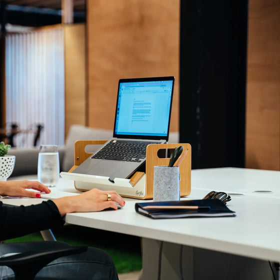
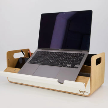
Second, the redesign introduced portable workspace tools rather than relying only on fixed furniture. This was a critical shift. In flexible workplaces, not every need should be solved by adding more built-in elements. Employees needed a way to carry their essential setup between home, office and touchdown spaces while keeping everything organised and protected. Portable organisers, laptop stands and compact storage systems made that possible.
Third, ergonomics were treated as part of mobility, not separate from it. That distinction often gets missed. A desk-sharing office can have excellent chairs and height-adjustable desks, but if people are still balancing laptops too low or hunting for accessories, the ergonomic promise falls apart in use. Lightweight, easily deployed supports helped users reach a comfortable setup in seconds rather than settling for compromise.
Finally, the redesign aligned physical changes with behavioural expectations. Clean desk policies were no longer framed as rules alone. They were supported by storage logic, portable systems and a clearer understanding of how people moved through the space.
Why portability made the difference
This is the point many redesigns underestimate. In a hybrid environment, the workstation is no longer a fixed place. It is a repeatable setup.
When users can carry a coherent workspace system - laptop support, organiser, tech essentials and everyday tools - they recreate familiarity across locations. That continuity improves more than neatness. It reduces cognitive load. People spend less time adapting and more time working.
In this project, portability also helped solve a common tension in premium office design. Employers wanted a refined, uncluttered look. Employees wanted practical control over their day. Portable accessories bridged both needs. Desks stayed visually calm, but individuals could still personalise function without leaving a permanent footprint.
For brands such as Gustav, this is where product design meets workplace strategy. Award-winning mobile workspace tools are not just accessories added at the end of a fit-out. Used well, they become part of the operating model of the office.
The results: fewer compromises, better daily flow
The redesign was judged on daily performance rather than novelty. Within weeks, three changes stood out.
Setup time dropped. Employees no longer arrived and improvised. They had what they needed, knew where to place it and could transition quickly into focused work. That matters more than it sounds. Saving even five minutes per person, per day, is significant at organisational scale.
Perceived clutter fell sharply. The office did not become empty or sterile. It became legible. Shared desks looked shared, and end-of-day reset became easier because the system supported it. Facilities teams reported fewer abandoned items and less visual drift during the week.
Comfort improved, particularly for laptop-based work. Users who moved frequently between home and office benefited most, because their working posture no longer depended on what happened to be available at each location. Consistency became a feature of the experience.
There were softer gains too. Employees described the redesigned workplace as calmer and more professional. That language matters because it points to trust. When a space feels resolved, people are more likely to use it as intended.
Trade-offs the project had to manage
No credible workspace redesign case study should pretend every intervention is universally right. This one involved trade-offs.
Portable systems require adoption. If the tools are poorly designed, too bulky or visually out of step with the office, staff will leave them in lockers or ignore them entirely. The product choice therefore matters as much as the principle.
There is also a budget question. Loose accessories can look like a smaller line item than furniture, but scale changes the maths quickly. Still, the comparison should be fair. The cost is not just the product itself. It is the value of faster setup, cleaner shared desks, reduced replacement of ad hoc items and a more consistent employee experience.
Then there is the cultural layer. Some teams adapt easily to desk sharing with mobile tools. Others still want a stronger sense of ownership. In those environments, redesign may need a mix of shared desks, assigned settings and neighbourhood-based storage. Flexibility does not mean forcing one behaviour on every role.
Lessons for future workplace projects
The strongest lesson from this workspace redesign case study is that modern workplace performance lives in the details users touch every day. Not only in furniture specification. Not only in space planning. In the small systems that determine whether a desk is easy to use at 9am and easy to reset at 5pm.
That has practical implications for project teams. If you are redesigning for hybrid work, assess the setup journey as carefully as the layout. Observe what people carry, where they hesitate and which workarounds they have invented for themselves. Those workarounds usually reveal the missing layer in the design.
It also helps to think in terms of workspace ecosystems rather than isolated products. A desk, a chair and a locker are not enough if the user still lacks an organised way to move between settings. The more flexible the workplace becomes, the more valuable coherence becomes.
Good redesign does not ask people to be tidier, more disciplined or more adaptable than the environment allows. It gives them a system that makes the preferred behaviour the easier one.
That is why the most effective offices now feel less like static installations and more like well-composed frameworks for movement, focus and everyday order. If your current workplace looks finished but still feels awkward in use, the answer may not be another major fit-out. It may be a better way to help people carry, place and use the tools they need wherever work happens next.